Everything you need to need to know about the new look of your Grab Driver app
Your app experience has been revamped!
Hello driver-partners,
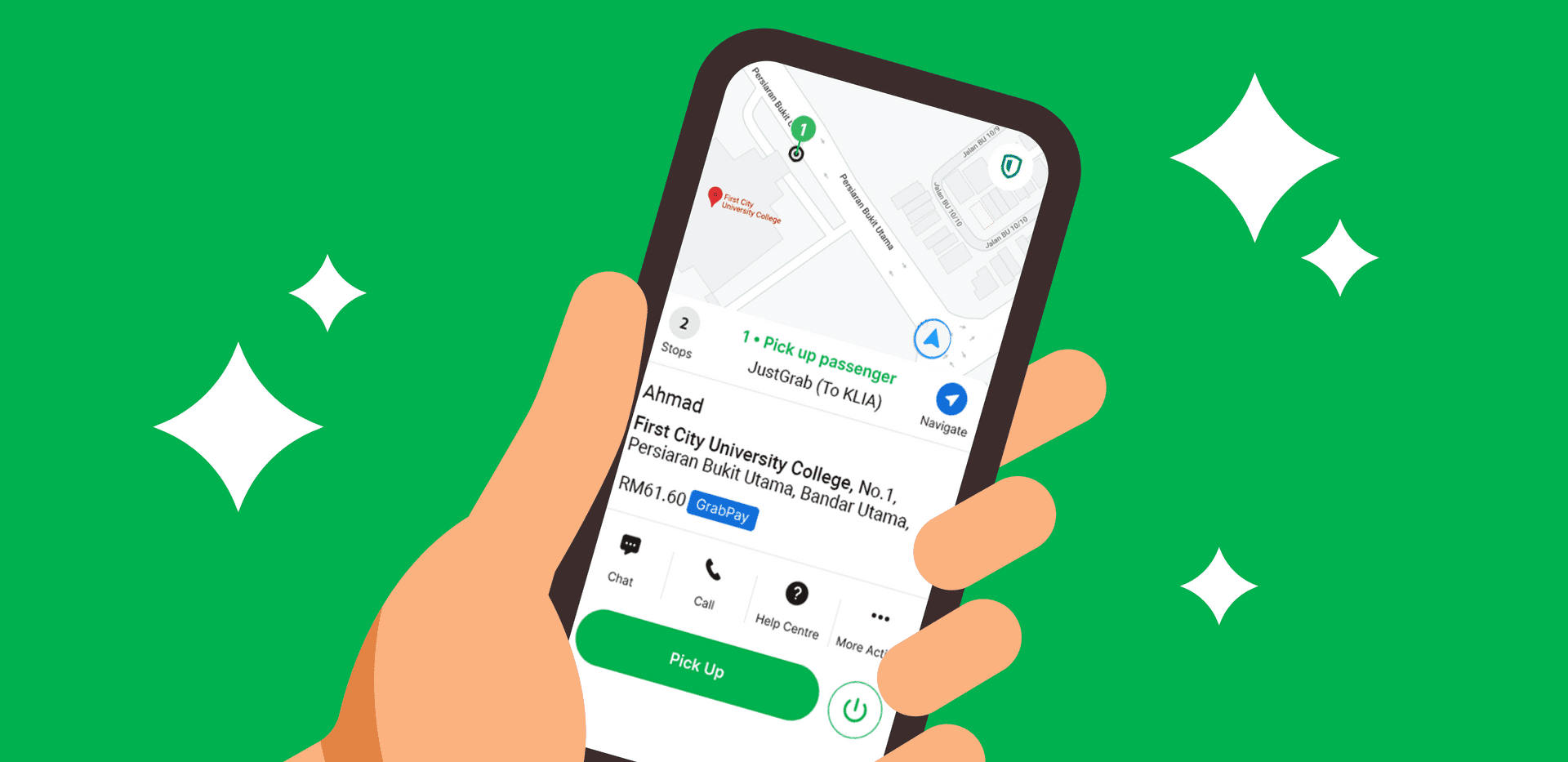
Two months ago, we revamped your homescreen to give you a cleaner interface, making it easier to navigate. Today, we are excited to let you know that we have redesigned the entire ‘Job Experience’ – this means all the screens that appear on your app while you are in transit, or in the process of a trip or delivery, have an all-new refreshed look.
Why the change? This update comes after several months of listening to your feedback and our own research, to bring you a cleaner and more efficient interface. All for a better optimised experience as you accept and complete jobs on the move.

What can you expect with this new change?
![]()
It will be easier for you to navigate from one stop to the next.
![]()
All your important features in one place for fast access when you need it.
![]()
Everything you need to know for a booking on one screen.
To learn more about the changes, watch the tutorial on GrabAcademy

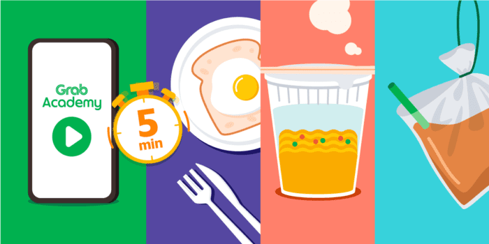
Take a tour to see what’s new and how it works – it only takes 5 minutes. You’ll be done before you finish your breakfast, or before your instant noodles are cooked. It’s that quick!
Make sure you use the latest GrabDriver application to watch the tutorial video and to experience this new interface. Update your application here (ios | Android)
